
LOGOS
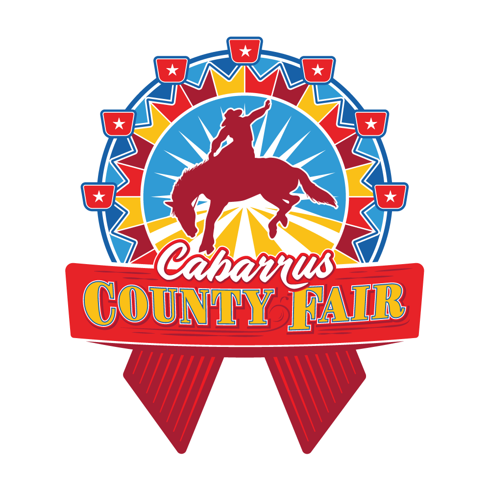
Cabarrus County Fair
Logo designed for the new rodeo-themed Cabarrus County Fair. The brief suggested a fun and bright color palette combining rodeo, agriculture and traditional fair iconography with a nod to western-style motifs.
The logo is modular so that the bottom and top portions can be used separately, with and without ribbons.
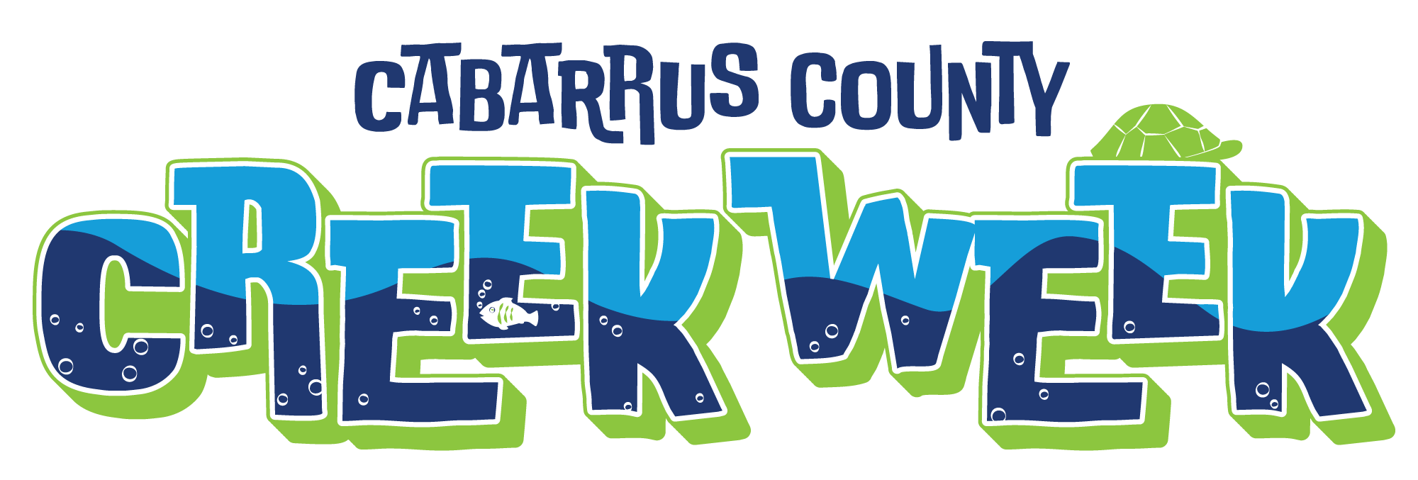
Cabarrus County Creek Week
Cabarrus County Parks & Recreation commissioned the design of this light-hearted, 3-color logo, to celebrate Creek Week 2025.
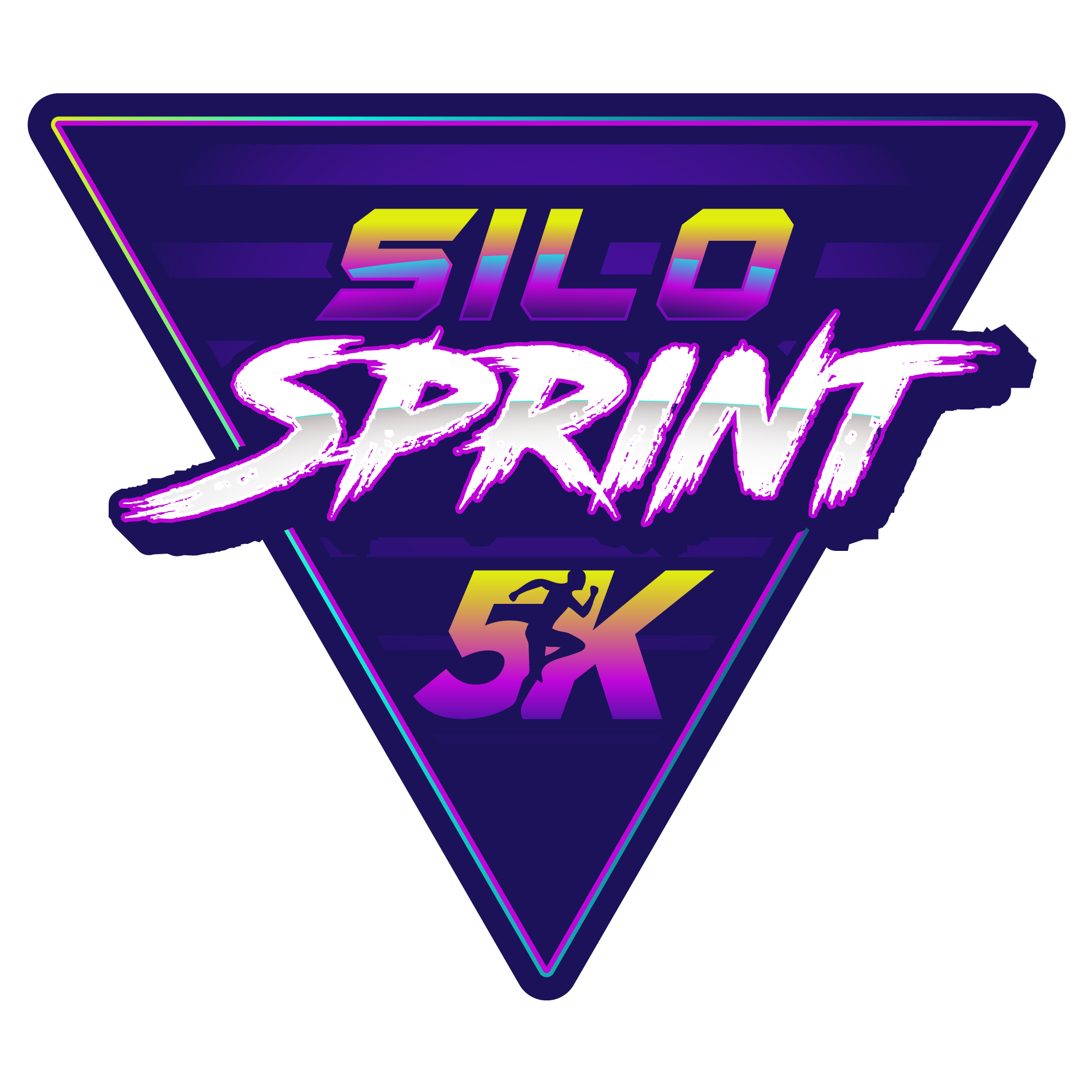
Silo Sprint 5K
Cabarrus County Parks & Recreation commissioned this 80's themed logo for their annual 5K run at Frank Liske Park in the spring of 2025. The logo brief required the integration of their existing 5K runner logo.
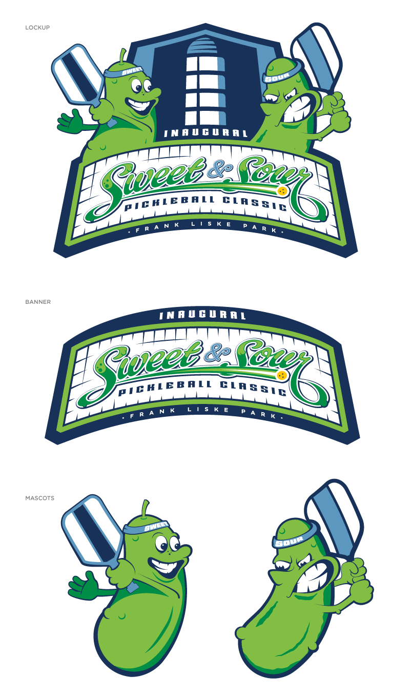
Sweet & Sour Pickleball Classic
In Spring 2024, Cabarrus County commissioned a logo for their inaugural Sweet & Sour Pickleball Tournament at Frank Liske Park. The brief required an illustrative, modular design with characters that could be used in isolation on different advertising mediums.
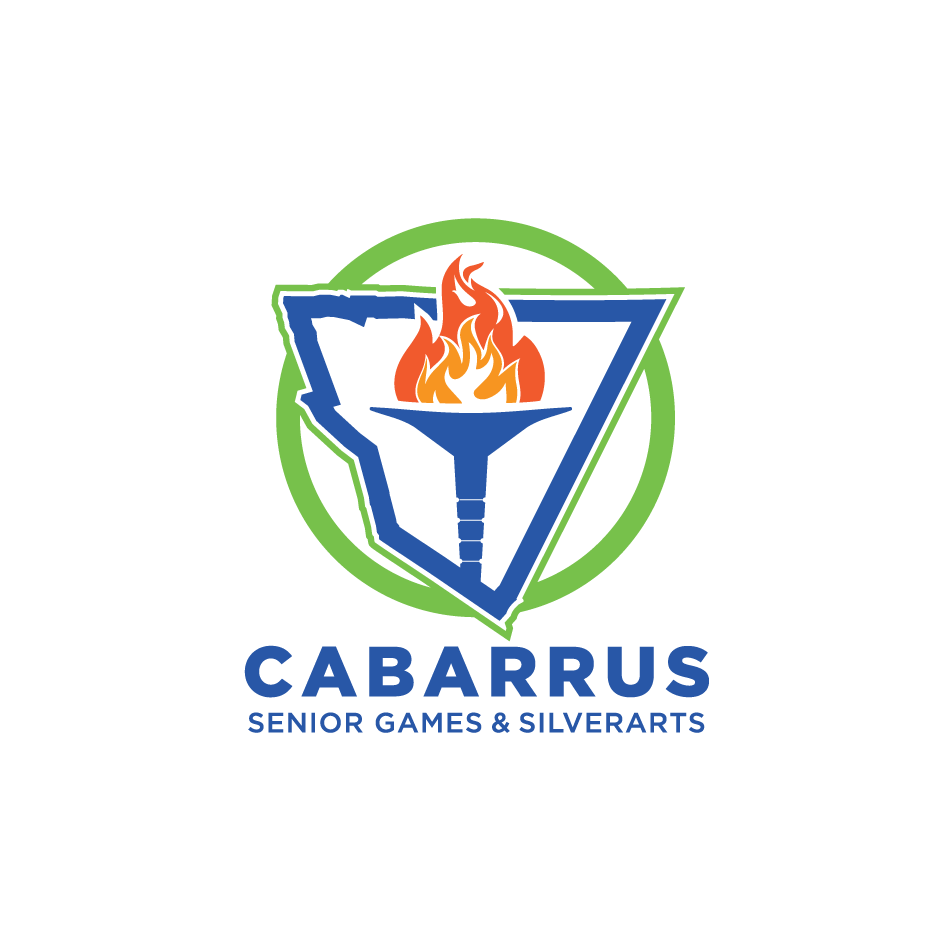
Cabarrus Senior Games & Silverarts
Re-designed logo for Cabarrus County Seniors - Active Living Program. Logo used for medals, t-shirts and other signage at events.
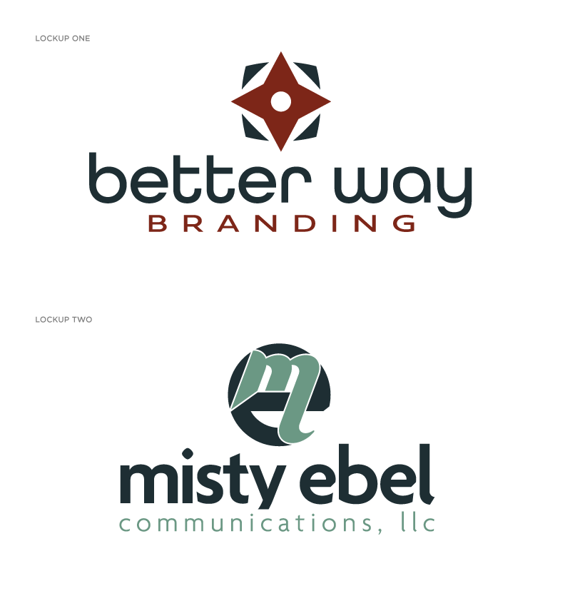
Better way Branding &
Misty Ebel Communications, Inc.
The client approached us to develop a logo for a new business endeavor as well as a personal brand logo. Since the logos appear together on some communications, it was important that the fonts & colors worked well together.
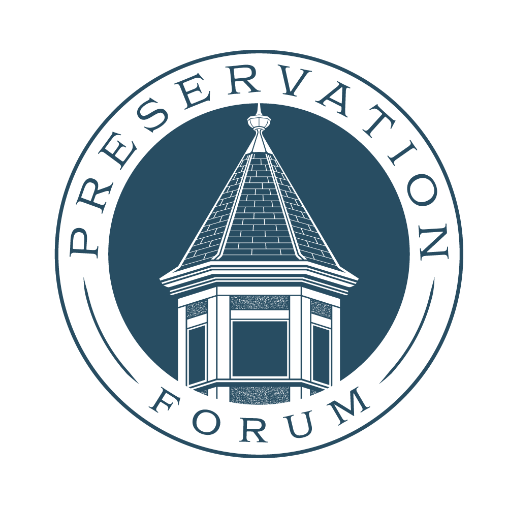
Historic Salisbury Foundation
Historic Salisbury Foundation asked us to design a logo for their newest event geared toward local real estate agents, lawyers, etc. interested in learning more about historic preservation. The turret in the logo was fittingly modeled after a local home under restoration in Salisbury.
DogPro
DogPro approached us to create a logo for their new business which develops training tools for hunting dogs. Modeled after the iconic Blue-tick Coonhound, this abstract version was conceived as a modular system in order to give them extreme flexibility when implemented across their sales/marketing initiatives.
main realty
We worked with Main Realty to create a sophisticated abstract design expressing their ideal of simplicity and versatility. During discovery it was clear they wanted to stand out from the white noise of traditional real estate iconography. To cut through that noise we focused on creating an organic form tied to the company name that would work well across all print and digital applications. To help facilitate this we developed a modular system to maintain brand consistency.
Bumtown Bombers
We designed this modular logo for a local travel baseball team, which included a brand mark (mascot icon) and a word mark. As noted above, the full-color version might work well for a website, bumper sticker or banner, but it wouldn't work for a screen-printed t-shirt or monogram. In those instances a strong base logo is important because it allows 1, 2 or 3 color printing.
Youth One
Westside Church needed a logo for their middle school program - Youth One. What we designed was a simple word mark that functions well as a 1, 2 and full-color design.